Interactive Dashboard – Optum
Product Design/Ux
Dashboards are excellent for providing high-level insights and quick analysis. They become even more powerful when interactive elements are introduced.
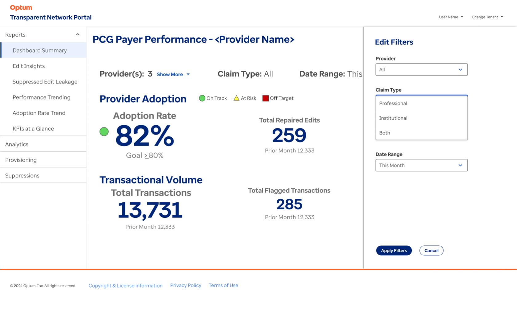
This portal I designed for a product team at Optum Insight applies rules for claims processing, offering a suite of tools that allow payers and providers to edit and validate medical insurance claim submissions.
The portal’s Reporting section defaults to a Dashboard Summary screen, presenting key high-level information. However, it also includes interactive controls that dynamically adjust both the dashboard content and the associated screens within the Reports section.
When designing dashboards, I focus on opportunities to provide additional details that support high-level insights. However, since these details aren’t always necessary upfront, it’s crucial to determine where, when, and how to present them effectively.
For this product, I placed much of the interactivity within filters while also incorporating additional interactive elements to reveal more details when needed (see illustrations and captions for reference).
Given the nature of a dashboard, prioritizing information display was essential. Through dedicated data visualization meetings with the client, we determined the hierarchy of information—ensuring that the most critical data appeared first, followed by secondary and tertiary insights, positioned accordingly on the screen.
To enhance efficiency and consistency, we adopted a templated design approach. Since similar screen structures serve different user types, this strategy streamlined development, improved product management, and ensured a more cohesive user experience.
Through a series of data visualization meetings, the team identified the most important data and collaboratively determined its placement on the screen.
Additional information about the Providers is accessible via a “Show More” link, which expands a dropdown displaying their names and associated identification numbers for quick reference.
An additional layer of provider information within the “Providers” filter component is accessible through a second drawer, which overlays the first and retracts when not in use.
All filters use a standard dropdown UI to refine the dashboard content and other screens in the Reporting section.
Ux & Product Design, Information Architecture, Interaction Design


